The Problem With Bar Charts

This post is adapted from a talk I gave as part of a Tableau Users Group meeting called “Bad, Biased, and Baffling Bars.”
Bar charts are supposed to be the “easy” visualization. If somebody is going to understand any type of chart or graph, then you’d hope it would be bar charts. What I am proposing here is that bar charts are only superficially simple, and this hidden complexity causes problems, and maybe that means rethinking what bar charts are good for.
For one, I hold that “bar charts” are not actually one type of chart, but are two very different charts that have been conflated because they look the same. I am heavily borrowing in this post from a recent paper from Sarah Kerns and Jeremy Wilmer with the great title “Two graphs walk into a bar.” Their observation is that the typical pedagogy of bar charts disconnects from the typical usage of bar charts. In particular, they argue that most pedagogical material for bar charts begins with what I am calling the “Stack of Stuff” (SoS) metaphor for bar charts, which I will distinguish from the later umbrella notion of the “Aggregates by Category” (AbC) bar chart. A Stack of Stuff bar chart is a chart where you have countable quantities of stuff divided up by category, and the height of each stack is then turned into a filled bar. It’s a common metaphor for thinking about bar charts, especially when you’re teaching what charts even are (to, say, young children). Here’s a montage of SoS examples I found by Google image searching for “bar chart lesson plan,” for instance:

In each, the process is similar: you go from tally marks or discrete objects or blank squares to fill in, and a bar chart is just stacking objects or coloring in one level for each count per category. This is a totally reasonable way to make these things, and the visual metaphor works well in a lot of cases. One colored stack is twice as tall as another? That’s because there were twice as many pieces of candy or whatever that were that color. There’s a straightforward procedure to go from new data to new bars. The mapping from underlying data (or, in the candy/object case, from actual things in the world) to the visualization is straightforward, reversible, and extensible. And the resulting charts aren’t just useful for pedagogy: you can create more complex kinds of stacks than just counting M&Ms by color. A lot of isotype charts are just stacks of stuff, after all:

SoS bar charts are not just limited to discrete objects, either. For instance, some of the earliest examples of visualizations that we would recognize as bar charts were made by putting a measuring stick or gauge (or even a purpose-built structure like a Nilometer) into a river, marking up how high the water goes on the stick (I guess this is a “stack” of water if you like), and then juxtaposing those measurements together. The result is, as far as I’m concerned, a bar chart. Here, for instance, is what Michael Friendly calls “the first known bar chart” (predating William Playfair’s commonly cited bar charts by a decade or so), showing water levels in the Seine river:

And here’s one showing high water marks in the Elbe river during a set of floods from 1501–1784, which Sandra Rendgen likewise refers to as a “proto-bar chart”:

Rendgen makes, I think, a pretty compelling case that the form of the bar chart arises pretty naturally from these kinds of hydrological measures. Higher water levels correspond to measures that are higher up on the physical gauge out in the world. So, just like you can go from stacking Skittles to categorical bar charts of integers without too much cognitive effort, so too can you go from continuous gauge measures to temporal bar charts of continuous values. It’s literal floating point arithmetic.
But, as I mentioned several paragraphs ago, SoS bar charts are just one type. The other is AbC: Aggregate by Category, where each bar is not a single measurement or a stack of counts, but is an aggregate whereby multiple values (or perhaps even an entire distribution of values) are condensed into a single value. I’ve seen AbC charts of means, medians, modes, or even standard deviations. But not all aggregates work like counts, and not all aggregates stack!

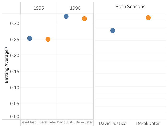
So it’s here in AbC land where, despite looking exactly the same, the metaphors and expectations built up from SoS bar charts fail us. For instance, here’s data I grabbed from one of Wikipedia’s examples for Simpson’s Paradox, showing a seemingly contradictory pair of insights: David Justice had a higher batting average than David Jeter for the 1995 and 1996 baseball seasons, but, when you look at their overall performance for the two seasons in question, Derek Jeter has a higher batting average.
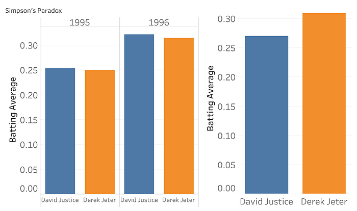
This is very counter-intuitive! Stacks of stuff don’t flip their orderings like that when you aggregate them. If you’ve got two bar charts, of, say, colors of Skittles in a pack, and green is the most common Skittle color for each pack, then you’d be shocked to learn that, when you add both packs together, purple comes out ahead. Of course the reason for this is that batting average is just that, an average, and so depends on both the number of hits and the number of at-bats. And averages, like many other aggregates, don’t “stack”. A difference in height in stack-land is a difference in count, and differences in count have pretty nice algebraic and geometric properties. A difference in generalized aggregate-land has fewer guarantees.
The “paradox” here is resolved when we switch to an SoS style bar chart, in this case of counting hits in red, and at-bats that didn’t result in a hit in grey:
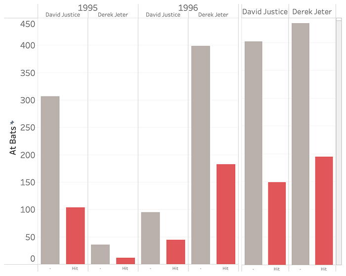
Derek Jeter had much fewer at-bats for the 1995 season, which was a year where both of them had worse performances. In 1996, when both performed better, David Justice had much fewer at-bats. So when you add both seasons together, Justice’s higher at-bats during the worse year counteract his slightly better averages in both years.
But the specifics here are less important than the fact that an extremely important quantity (the denominator of our average) can “hide” in an AbC bar chart in a way that counts can’t hide in an SoS bar chart. Here’s several more examples from Andrew McNutt’s post on our work on what we term “visualization mirages”, for exactly this kind of behavior where there are hidden factors that are otherwise invisible in a visualization but dramatically impact the strength or validity of conclusions:
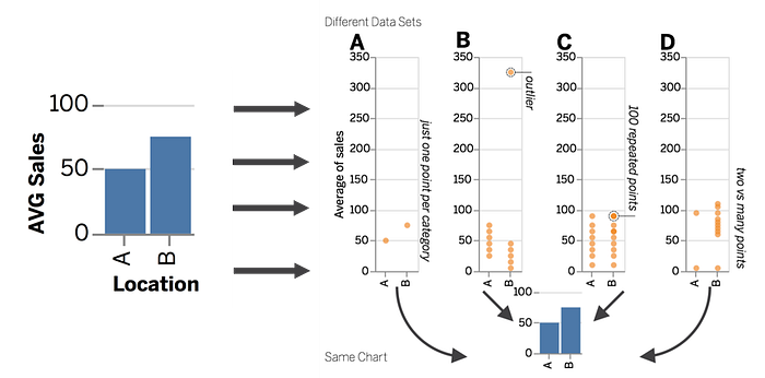
An apparent difference in an AbC bar chart could have a number of underlying “causes”: perhaps the difference is driven by a single outlier, or by large differences in sample size, or even underlying data quality issues that would be visible through inspection of the underlying distribution of points. But, without some visual and/or statistical interrogation of the underlying data, we simply don’t know. The visual encoding of the bar in an AbC bar chart is therefore a bit of a “false friend” in a way, since it looks like a stack and we think it acts like a stack, but it doesn’t.
That’s just a statistical issue with AbC bar charts. There are perceptual issues as well. Here I’m borrowing (and, to be honest, pretty irresponsibly over-interpreting the results) of yet another paper, “Bar graphs depicting averages are perceptually misinterpreted: The within-the-bar bias.” What they found is that, if you use bar charts for predictions, because we’re so used to seeing bar charts as stacks that “contain” values, stuff inside the bar is perceived as likelier than stuff outside the bar. Here’s what I mean:
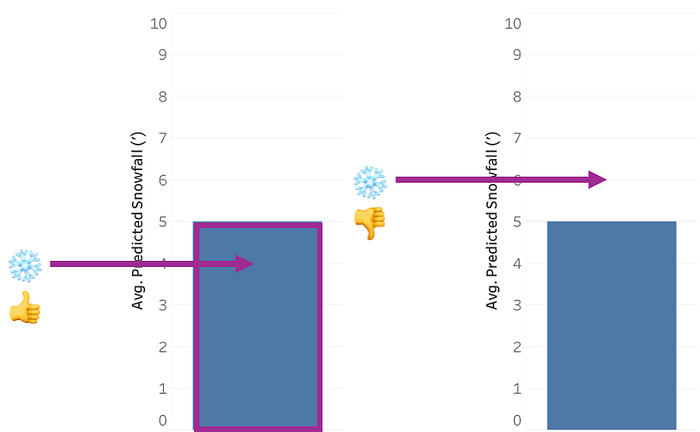
Suppose there’s a big snow storm that’s rolling in, and the news predicts that there’s going to be 5 feet of snow in your region. But of course that’s just a prediction with some uncertainty to it. The actual snowfall could be higher than 5 feet, or lower, or there could even be no snow at all. If you ask people about outcomes, you’d expect people to find actual snowfall that’s roughly in line with predicted snowfall to be the likeliest, and then tapering away as you move further away, something like this, more or less:
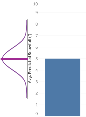
But that’s not what George Newman and Brian Scholl found, in the paper I linked to above. Instead, they found a “within-the-bar” bias, where predictions that just so happened to fall within the visual area of the bar were perceived as likelier than predictions that happened to fall outside. E.g., 4' of snow? Sure, that could happen. But 6' of snow? No way (or, at least, much less likely):
It’s an effect that we found as well, and it seems to happen (or happen more saliently) with bar charts, and not other ways of communicating means, like dot plots or gradient plots or what have you. If bar charts are just stacks of stuff, you can see why this asymmetry would arise, right? Like, if I have a stack of four red pieces of candy or whatever, it’s possible I could end up drawing one, two, three, or four reds from this stack, but there’s no way I could draw five. So the idea that a bar chart represents a symmetric distribution just doesn’t mesh well with bar charts as either a visual or conceptual metaphor. This conceptual mismatch links all the way back to the Kerns and Wilmer paper that motivated this piece, where they observed that a significant subgroup of people simply have a hard time thinking that a bar chart made up of samples could be anything other than a stack of stuff under the bar, rather than stuff centered around some average. In fact, Kerns and Wilmer think that this “within-the-bar bias” is not actually a universal visual bias, but the result of what happens if you have heterogeneous populations of people of AbC and SoS bar chart readers and then average their results together. But in either case, it’s a problem!
And it’s not just limited to individual bars. Bar charts are visually asymmetric across their value (stuff under the value is colored in and salient, stuff above the value is not). This leads to measurable bias in all sorts of estimates involving bar charts, not just likelihood. Visual estimates of linear trends? Biased slightly away from the true value for visually assymmetric designs like area charts, but not lines charts or scatterplots. Averages of groups of bars? Likewise biased away (“perceptually pulled,” per Xiong et al.) from the true value. A bar is a big and salient thing, but, especially in AbC bar charts, this saliency is not actually particularly meaningful or important for most tasks.
Okay, you might ask, so if bar charts are prone to misconceptions and misreadings, what should we do instead? I don’t think I’m proposing anything revolutionary, but I think in general I’d propose that SoS bar charts should be the assumed default, since AbC bar charts introduce potential confusion that could be mitigated (although perhaps not totally removed) by using something else.
In short, if it makes sense to make something a bar chart, make it a bar chart. Got countable quantities of stuff with nice additive properties (that is, “stackable” stuff)? Great, a bar chart is both easily to explain and also a congruent visual metaphor. I think this constraint is a pretty wide one. Not just depths of rivers but sales and inventory over time, votes in an election for particular precincts, or measures of a specific categorical outcome: all great bar-shaped stackable data. But if stacking doesn’t make sense, either because the difference along the axis isn’t directly comparable in the same way that a stack of stuff if, or because you don’t want to draw a distinction between inside or outside of the bounds of the bar, then use something with a different visual metaphor. Dot plots, for instance. If you need to convince somebody about this who is deep in Edward Tufte-land, just say that bar charts use a ton of ink to draw a big rectangle when you only need to read off the value of the tip of that rectangle, so you should probably make sure you’re actually getting something valuable for all of that expenditure.
I will pay special attention to the case where what is being visualized is some central tendency of a distribution. I think getting people to understand what’s happening under the hood to generate an aggregate value, or to grasp that a difference in aggregates can have lots of distributional causes, is important enough to waste ink on. I have, in the past, even been tempted to go so far as just throw the whole kitchen sink at the problem and include not just central tendencies but also raw values and density curves and so on. Maybe you don’t need to go that far, or not all the time, but you should do something, and, no, just throwing an error bar on top of the bar chart isn’t going to cut it. I should, however, point out that a histogram is a very nice, almost quintessential example of an SoS bar chart, and so we could actually have a virtuous cycle here where we could use the well-understood SoS bar chart metaphor in histograms as scaffolding to help people understand the distributions that underly potentially murkier AbC bar charts.
Okay, you might reply, but people don’t understand distributions and they do understand bar charts. My first reply to this objection is — as this post has been dancing around — that, well, not everybody understands bar charts. Or they understand them in a specific way that doesn’t match with the wider ways they are used in practice. My second reply is, if it is true that your audience just “doesn’t get” distributions (and I don’t know that this deficiency in your audience is inherently and unfixably true, or if it’s just a sign that you haven’t fired enough designerly brain cells at the problem; I think we blame a lot of failures of design imagination on “visual literacy” issues when there’s really just a failure to meet audiences where they are rather than where we assume they ought to be), then, since distributions are so important to understanding phenomena, then you’re telling me the entire communicative goal is doomed from the outset, in which case maybe showing nothing would be better, rather than showing people a narrow and potential misleading thing that your audience thinks they understand.
Wrap Up
Do I think this blog post is going to unseat bar charts from their throne at the top of the visualization hierarchy? No, not really. I don’t even think I’ve made the case to show that bar charts are uniquely or obviously bad or worse. The effects I talk about in this post are often small in absolute terms, or occur in subsets of the population rather than universally. Maybe the benefit you get in not having to explain what error bars are to your audience is worth the potential for bias and misinterpretations caused by (mis-)reading a bar chart. And it’s not like error bars or the other alternatives don’t come with their own potential misinterpretations and misreadings either. But I think I’ll call it good if I can get you to realize:
- Even “simple” or “default” visualization designs still carry a lot of baggage in the form of the pedagogy used to introduce them, the visual metaphors they employ, and the mental models and assumptions we construct in order to interpret them.
- We should get over our reluctance to introduce more complexity in visualizations, and specifically think about communicating distributional properties other than just a single aggregate. A mean value, per se, is just, to me, either relatively uninteresting or potentially misleading (even before we get into what happens when people focus on a single number over the expense of everything else).
Thank you to Matthew Kay for comments on this post.