The Spectacular Dashboard

This post was collaboratively written by Heather Froehlich and Michael Correll as part of our “Provocation” submission to the Visualization for the Digital Humanities workshop at IEEEVIS 2020, “Making Sense of a Sea of Dashboards.”
Tl;dr: Dashboards in the visualization community are often conceived of as decision-support tools that sharpen the mind, triage otherwise ungraspable amounts of information, and bring into focus a single accurate and actionable picture of a subset of the world (as admittedly fraught and positivist as that project is). But we see a troubling trend of dashboards specifically, and massed collections of data more generally, acting not as aids to decision-making but as devices to be passively consumed or observed: spectacles to “take in” rather than tools to guide action. In fact, many of these new “spectacular” dashboards have the effect (intended or otherwise) of numbing or blunting decision-making capabilities. The resulting culture of dashboards can be depersonalizing, defamiliarizing, paralyzing, and conspiratorial. The visualization community is woefully unprepared to study dashboards in this new guise, our design guidelines and best practices have little that speaks to designers of these dashboards, and our theories do not seem to predict their impacts or forms.
To illustrate what we mean by the “new guise” of dashboards, let’s begin with some anecdotes of our personal use of dashboards over the past year:
In the middle of September, forest fires blanked the west coast of North America in hazardous amounts of smoke. Michael lives in Washington State, and would check air quality on airnow.gov. But the numbers there would not seem to match up with what you’d see on an Apple Watch, so he’d sometimes check the map on purpleair.com, which had cloud-connected sensors right down the street from him. But of course there was no guarantee of the effectiveness of those decentralized sensors: in the middle of the most hazardous days, there was a sensor always reporting “green” that turned out to be on someone’s kitchen counter. Plus he wanted to know when things would clear up, so he’d go to wasmoke.blogspot.com and get forecast information and context. That blog also included a map and dashboard, but that one was republished by the PNW Smoke Coordinators at tools.airfire.org. Different maps, different sensors, different data (some only had PM2.5, others had more complex air quality measures), different analyses (historical tracking and/or forecast data), and different dashboards.
It’s an information foraging process he was quite familiar with; earlier in the year he’d followed roughly the same routine when tracking the early spread of COVID-19, going from the JHU’s ominous black and red dashboard to Tencent’s mobile-first dashboard, to UW’s IHME prediction and modeling dashboard, to the Financial Times or the Washington Post data portals, and later on per-state “reopening” dashboards, each of which had different metrics, models, and foci. They would disagree with each other, either in literal terms of the values they were presenting, or rhetorically in the messages they sought to convey, so much so that Alexander Lex argues that dashboards may be entirely the wrong medium for COVID-19 information.
Heather followed a similar process in Central Pennsylvania, seeking out the daily and weekly COVID-counts in her county and state. When her employer, Penn State, brought back the students to her small college town in August, she added the university’s dashboard to her rounds. When the numbers started to jump, she similarly sought reassurance from other counters– surely we couldn’t be as bad as Pittsburgh or Philadelphia or other known hot spots. Some of her colleagues got worried that the state and county were fudging numbers and started developing their own trackers. While Heather never got the smoke from the forest fires Michael experienced, she found herself doing similar rounds to different air-quality and fire trackers as they applied to people she knew out West.
It is always a bad sign when one is extrapolating one’s individual behavior to the masses, but we believe there are a few things interesting about these kind of “anecdata” as they relate to our form and culture of information visualization:
- We didn’t have a dedicated “home base” dashboard, with the other dashboards existing as counterfactuals or ways to pierce “filter bubbles” or provide evidence to confirm or disconfirm hypotheses or anything otherwise particularly noble from an epistemic hygiene standpoint. Instead, we found ourselves clicking aimlessly around a bunch of dashboards that purported to show the same information. We certainly had beliefs about accuracy or bias or credibility of particular dashboards, but we didn’t have a central “authoritative” dashboard to go off of. The phenomena under analysis were so fuzzy and had so many options for measurement that we were not necessarily certain that such a dashboard could exist, even in principle (even “official” dashboards from government agencies often didn’t have all the information or context we needed).
- There was very little we could actually do as a result of our information consumption. Or, rather, very little that we would have done differently as a result. The sky was yellow and smelled like a campfire; Michael wasn’t going to go fishing for a dashboard that gave him the best smoke result and use it as justification to run a marathon or anything. Similarly, when we were looking at case numbers out of first east Asia and then cruise ships and then by their ones and twos to dozens and hundreds in the rest of the world, there wasn’t much we could personally do in the short term with the data we had at hand other than passively consume it. It was behavior closer to “doomscrolling” through one’s social media feeds: building up anxiety about the state of the world as one learns about what is happening one tweet or data point at a time.
We found ourselves independently, then collectively, becoming wandering information flâneurs, moving aimlessly between different dashboards for sheer consumption rather than driving any particular decision-making. We knew things were bad. We merely wanted to get a picture of just how bad (or when things might get better). To do so, we were seeking out myriad perspectives on what theoretically was meant to be the same thing. Our goals for this sort of dashboard consumption did not seem to be analytical: we found ourselves wanting to be reassured (that things are trending the right way, or even just that there even were experts who are keeping track of which way things are trending) or, perhaps perversely, negatively reassured that our unease or dread or weltschmerz were grounded in some sort of proof that, yes, things really are as bad as we thought they were.
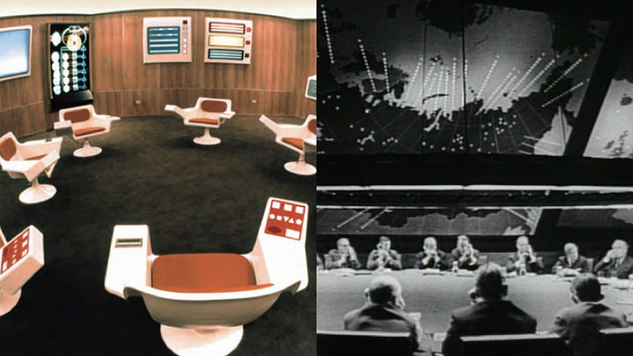
Our behavior of anxiety-driven somewhat hapless consultation of multiple sources seems dramatically opposed to the rhetorical and epistemological project of a “dashboard” as ordinarily conceived in the visualization community. What we now consider to be a “glanceable” collection of data on display for someone to survey regularly was initially a physical object at the front of your carriage (to keep the mud off), gradually collecting instrumentation and knobs and dials through the automobile and aviation era. Shannon Mattern claims there is a direct throughline from these early physical dashboards that exist as increasingly complex collections of instruments to a more modernist (and positivist) conception of a dashboard as a “command center” or “mission control” where all relevant information flows into a central place to be acted on immediately if need be. While our automotive dashboards carry on this lineage (even the central tablet-like console of a Tesla is still supplemented by more traditional gauges for speed and fuel), a digital dashboard can take on arbitrary forms, and our interests lies in these differences: Derya Akbaba offers a survey of the range of ways different state COVID dashboards look and present information, and we see them all as striving to act as control centers, integrating information from primary, secondary, and tertiary sources about the state of the world.

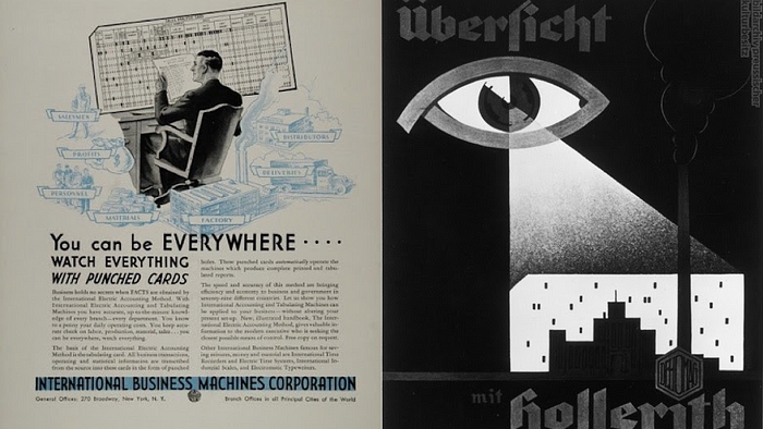
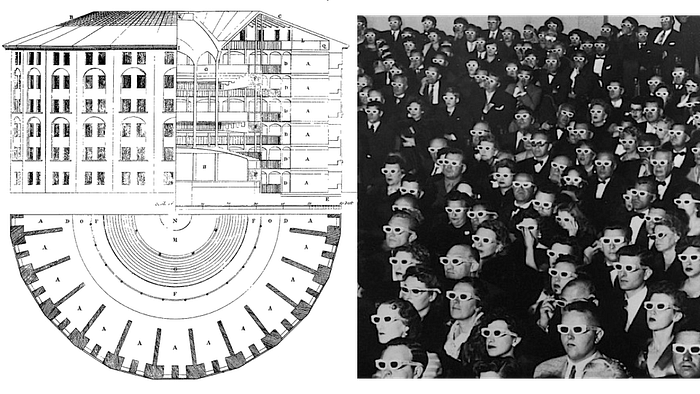
We find these aggregating dashboards to be eerily reminiscent of the panopticon: the promise seems to be that an analyst, situated in front of a dashboard, not only receives a direct line to objective truth taken in from all directions, but does one better than Haraway’s “god trick of seeing everything from nowhere.” The decision-makers are provided only the most relevant of objective truths: “seeing only the important things from nowhere”: maybe instead of a god trick, a “patron saint trick” of seeing the objective truth about one’s particular (perhaps hyper-specific) domain. A society oriented around such panopticon dashboards seems very straightforward: the world is incessantly monitored for massive amounts of “raw” data, that are “digested” into “key performance indicators” and then assessed and re-assessed in a steady cadence, the decision-maker seeing the metaphorical heartbeat of a company or city or a country. In this guise, the dashboard is the embodiment of an entire, partially self-negating mythos (or “storytime”). Dashboard failures are because we didn’t have enough data, or we didn’t have the right metrics, or we didn’t have the right focus on particular areas we were monitoring. For all of its faults, the dashboard as embodiment of the panopticon project makes it a familiar object of study. We can assess a panopticon dashboard by the efficiency with which it conveys the right numbers to the right people in as quick and accurate of a fashion as possible (but just think about what sort of epistemological commitments you need to take on board for that assessment to even be possible).
These panoptic dashboards function as focal points, and this framing extends also to how we talk about dashboard design as well. The implication is that there is a single source of objective information, and the job of the dashboard designer is to make sure as much of the important bits get to the analyst without distraction or corruption. In the past we have called this the ethernet delusion: “that the one goal of information design is to maximize the speed and throughput of data transmission to the human brain, as though a visualization is just a big ethernet cable sticking out of a server and into your occipital lobe.”

And yet, the anxious and aimless ways we consumed dashboards in our stories above do not seem to have signed on this project. While we watched and monitored our dashboards in panoptic ways (or in ways aligned with the panoptic goal), we did not have any illusion of power or control over what we were seeing. It was just another form of content to be consumed, like a new Netflix show. We all saw the same data, and we can commiserate together about it, or apply our own spins to it to differentiate ourselves while still operating in the same social framework. But unlike the moon landing or the Kennedy assassination or other spectacles with a large mass audience, where we have a shared visual experience (with all the conspiratorial thought creeping in after the fact), the sheer number, polysemy, and decentralized circulation of our current dashboard deluge problematizes that sort of anchoring use, and opens up space for suspicion and factionalism right from the start of things.
The growing population of competing and combative dashboards creates two immediate collective sociological implications. The first is to encourage the growth of counter-narratives and conspiratorial thought. Government agencies and mainstream journalism outlets, used as they are to the single authoritative dashboard that “merely” shows the data and may not seem to require explicit rhetorical positioning, often separate their analyses or commentary from the dashboard itself, leaving it up to the viewer to draw their conclusions. Using the language of contagion, the WHO mentions the spread of an “infodemic” in parallel with the COVID-19 pandemic. In the face of dozens of dashboards all proclaiming expertise but with differing data or implicit conclusions, it is a natural reaction to either become increasingly skeptical of the value of expertise, or increasingly emboldened to come up with idiosyncratic explanations in an attempt to generate a totalizing explanation for contradictory evidence.
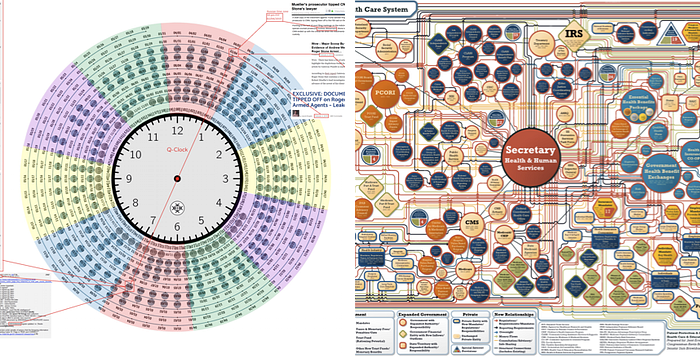
The second impact of the dashboard deluge is a numbing effect. This numbing can take on many forms. One sort of numbness is a virtualization of the real-world implications of the data being shown (the source of Dragga and Voss’s “cruel” charts), a substitution of the real-world referents of a dashboard with a “hyperreality” of metrics and charts. Bridget Cogley, speaking of the deluge of COVID-19 visualizations, specifically critiques this kind of numbing: “We think our job is to visualize the numbers and forget the humanity. We perpetuate harm by allowing numbness to be our modus operandi.” But another kind of numbness seems more directly fatal to the panoptic dashboard project, that of a numbing of our decision-making capabilities, a decision-paralysis. An overload of dashboards can operate as a sort of “gish gallop:” the impact of any individual piece of data or disagreement may be minor, but in concert create so much overhead that the analyst ends up doing nothing, forced into rabbit holes of investigating different metrics or standards and so kept away from the central decision-making task. For some dashboards this distraction and numbing might even be one of the rhetorical goals: to expose the layperson to the complexity of the data and so convince them that they are incapable of making a good decision about it without technocratic intervention. 538’s discussion of COVID-19 models has this flavor, attempting to convince the audience of the futility of constructing a single model of pandemic spread from the data available, but for a more sinister version there are the (intentionally nigh-illegible) visual summaries put out by the Republican party attempting to visually argue for the unworkability of the Affordable Care Act. Many modern dashboards, especially those with circulation to mass audiences, might serve not as decision-making tools, but decision-preventing tools, or decision-laundering tools for actions that have already been taken prior to any data.
For many of us, dashboards often become synecdoche with the idea of modeling: something computational that is meant to be a pile of facts. Uncritically approaching these dashboards means that we assume that every version of the data can be true, even when we know intellectually they can’t be, and we look at the data from every angle, hoping to make sense of multiple perspectives and find something reassuring. Each dashboard provides its own perspective on a set of information, presented in a particular way. In this endless deluge of aggregated data, we argue, it is impossible to have a single objective perspective on dashboard reporting. And in our daily sweeps of our preferred data providers, we add more clicks to the John Hopkins, NYT, and local web sites; tweeting or posting on facebook about them furthers their rhetorical and argumentative power. We argue that this level of engagement is not just participatory but a shared, collective experience of observation for the sake of showing up to observe, and without agency to affect any kind of meaningful change. It is this powerlessness, where we are stuck watching other people make decisions based on a range of differently-aggregated information, that we see a kind of social community begin to form: one that is passively observational but there for the participation grade.
As an example, when Penn State and other universities announced they would be bringing students back to campus for the autumn semesters despite the COVID-19 pandemic, many of these institutions developed their own dashboards to track spread and case numbers. Other institutions like the University of Iowa, UMichigan, Northeastern, Boston University, Grinnell, and The University of Alabama (among many others) all developed their own dashboards too, and these links show a range of ways the data is being represented. These are largely separate from the local or state dashboards that are immediately available, though in many cases the campus counts would feed back into other counters (county or state health departments). Now we had something new to survey providing a totally different set of numbers than our previous aggregators.
These context-specific dashboards provided a way of allowing us to track what was presumably driving certain administrative decision-making, thus adding a new layer to the ongoing panopticon of data-tracking. It no longer was about how many different places we can go to check our numbers, but do our numbers match what other trackers, such as county, state, and the Washington Post or NYTimes all say? How do we know the university isn’t fudging their numbers when the county count (reporting daily) looks different from the university’s (reporting every 4 days)? Rhetorically, it was easy to leverage these dashboards to place blame the University here: according to their tracker, our case counts kept going up and up with no visual potential for decline. This, by proxy, became a way for faculty and staff to track certain administrative decisions to bring the students back to our town. So while university COVID dashboards stand to illustrate administrative failures, this also introduces a new way of thinking about these aggregated collections of data as a form of public spectacle.

To consider dashboards as a “spectacle,” (in the Debord sense) we are acknowledging that everyone is watching the data, but we also understand that it is no longer about the practice of simply looking at this endless parade of data in hopes of making sense of it, or deciding when to let off of the metaphorical gas pedal. We’re now in the realm of watching for the sake of watching. In practice, the panoptic dashboard and the spectacular dashboard are both to some extent voyeuristic (they are both about seeing more, after all). But for the panoptic dashboard, we encounter an illusion of control: a mission control, a war room, metrics that someone can hit or miss. The spectacular dashboard, in contrast, lacks this level of control: we simply observe together, as bystanders. The spectacular dashboard, thus, leaves us without any sense of agency.
Such a form of defamiliarization becomes a world of passive consumerism: we watch the numbers, but we can’t do anything about it. tante, speaking about COVID-19 dashboards and portals specifically, claims “it’s all sports now”: “These are the stats. Teams winning and losing. This is the essence of our COVID-19 coverage. Getting certain numbers up or down or whatever.” Our data dashboards are not decision-making artifacts, but things we look at and root for or against. Sometimes we want to see the data go up; sometimes we want the data to take a downturn. We want the polling numbers for our candidate to go up, we want that R0 to go down, and while we might Monday-morning quarterback what we “should have done” the next day, we lack the expertise and the leverage to do much about it. The outcome is that we have become so many Leopold Blooms observing our world around us in great detail and curiosity, but ultimately left with no positive project to impact our situation. And the act of watching them becomes a Debordian spectacle not unlike Shirley Jackson’s “The Lottery,” where everyone arrives in time to watch the latest sacrificial update. These dashboards can’t make decisions for us, they can only show us what we think we could have done better or differently. And even in making us believe we are superior to someone else’s decision-making, we are self-perpetuating the Bloomsian inaction.
So if the panopticon dashboard is dead or dying, and its visions of independent and individual agency over an abstracted and aggregated world are dying, what are we left with? Dashboards as “consultation theater” to pretend that we have some control over decisions being made without us (and maybe even without much in the way of data). Dashboards as agents of an intentional “data deluge” to convince us that the situation is too complex for us to take any individual actions. Dashboards as the rallying standards of counter-narratives, ways to provide a veneer of structure and objectivity to lost causes and conspiracies. Dashboards as spectacles can do all those things: prop up the existing order, remove the desire to act, and sow doubt and confusion about the project of a shared reality of experience.

But if so, then the visualization community is ill-prepared. Our books don’t tell us how to design them, our studies don’t measure what makes them work, and our students aren’t being taught how to interpret them. Our nouns like “accuracy” and “efficiency” seem less important than ones like “circulation” or “persuasion.” The technical details of how a particular dashboard was built and the metrics of how well it “functions” as a technological artifact may be the least interesting or important things about it. The way to think about a dashboard might be less as a piece of technology and more an artifact of mass media, part of a long history of how technology supports the project of informing, placating, controlling, (and sometimes even creating) publics.